Blog 
Process III- Playing the surprise card
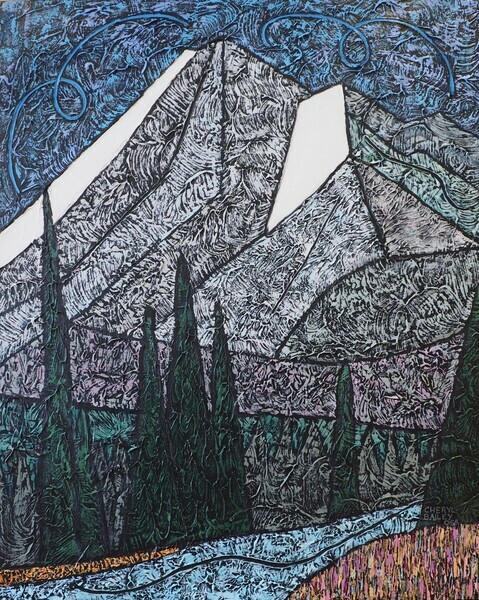
Here I am nearing the end of my play with this commissioned painting. The last thing I usually do is paint my signature ‘surprise’ somewhere.
First an explanation:
In art, colour intensity refers to the level of saturation of colour or the purity of the colour. A pure colour is straight off the colour wheel or rainbow. A colour that is not pure has been altered by adding black, white, gray or another colour. If the colour has been altered minimally, it is referred to as being high key or intense. If altered a lot, the colour would be low key.
The majority of my painting is usually very low key, grayed, colours. This is known as a sophisticated palette. Because I work on a black background, any colour will appear more intense than it would on another base colour. I am continually checking the paint mix against the black as I reduce the intensity. It is always surprising how little pigment is needed while working on black.
Amongst these low key colours, a small area (my surprise) of high key colour will show up like a red flag! The effective power of this small area can be further increased when the colour beside the surprise also contrasts in value(lightness/darkness).
See the painting Near Canmore below and notice how the tiny yellow-green tree carries the weight of the left side of the picture by covering it with your finger. See what it provides to the overall painting? In general, a small area of high power is able to balance a large area of low power. I love using this effect. Feel free to let me know how you see it.
Near Canmore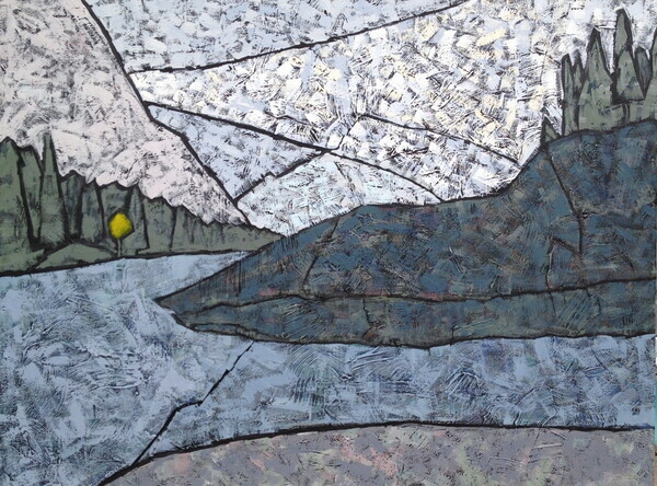
For the current work shown below, there is a brighter patch of mountain flowers on the right foreground corner. I did use the lovely long triangular shape on the opposite bank but this time, it is not quite as ‘surprising’ because it has effectively become part of the more colourful area which includes the wildflower patch and the blue stream.
There are lots of lines on which your gaze can travel to cover the view of the mountain and stream. When you reach the summit, you will notice the beautiful blue sky and the fun I had drawing in the medium underneath. This provides my viewer with another more subtle surprise.
I’m feeling good about my process. Happily, today this was reinforced by a quote on today’s Painter’s Keys newsletter:
“In degree, it’s the calculated addition of visual surprise and incongruity that makes works of art speak both to the artist and her people.”
Follow me on instagram @CherylBaileyArts  or FB
or FB  I’ll let you know when there’s a new post. Thanks for reading!
Rocky Mountain River