Blog 
Recently I was asked how I chose my paint colours. This is a fun question because there are so many ways to look at colour. The first bit is an intro to colour theory and terms. Then below is what I do.
Quick intro on colour theory to start:
A particular colour will have 3 qualities
1. hue
2. value
3. intensity (also called saturation)
There are 3 primary colours(red, blue, yellow), 3 secondary colours (violet, green, orange all made by mixing 2 primaries) and almost an infinite number of tertiary colours(made by mixing a combination of all 3 primaries in varying amounts). (There are 2 schools of thought on the use of the term “tertiary.” This is how we use it.)
Between the primary hues on the colour wheel, there is a range for each primary. For eg for red , it can be an red orange , or a red red orange or a red violet. For blue, there is blue-green, blue-blue green and blue-violet. These are also called tertiary because they have all 3 primaries.
Within intensity, a colour can be a very light red (with a lot of white-a pink) through to a pure red and on to a dark red (with a lot of black). This is tinting (adding white) and shading (adding black). You can also add grays of all different values which is called toning.
The intensity or saturation of a colour can also be reduced by adding another colour. This can result in the rich earthy colours or just mud. ( I guess mud is earthy)
The value of a colour refers to the lightness or darkness of a colour. A scale of 1 to 10 is used to describe this from black to dark greys through light grays and to white. Many artists use a gray scale card. This is a card with the 10 values from black through grays to white. If you put a paint colour next to your gray scale card and squint your eyes, the impact of the colour will lessen and you can see what value on the gray scale matches this particular colour is.
Here’s what I do:
I’m a bit of a matchmaker ;) because I like to rather closely match the values of the colours in a shape so that the shape appears flat. If I also closely match values in a group of shapes, I create a larger visual shape. This ultimately results in a “value structure” of lights, middles and darks in the painting which lends calm and avoids a busy-ness in the work For example:
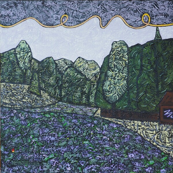
Lupins!
Busy-ness in the work is caused by a lot of light areas being mixed with a lot of dark areas. Not my style.
Sometimes I’ve decided on a colour scheme such as complementary (opposites) or analogous(colours beside each other) or monochromatic (just one colour) and stick to it. Other times I start there and then veer off to include other colours as well. Almost always I’ll have a blue since I love blue so much. A red is also very useful for moving the viewer’s eye around because we can’t not look at a red. This quality is called psychoactivity.
Over the winter, I lashed out and bought the Color-aid box (paint chips for artists) so I could just look/see/choose.
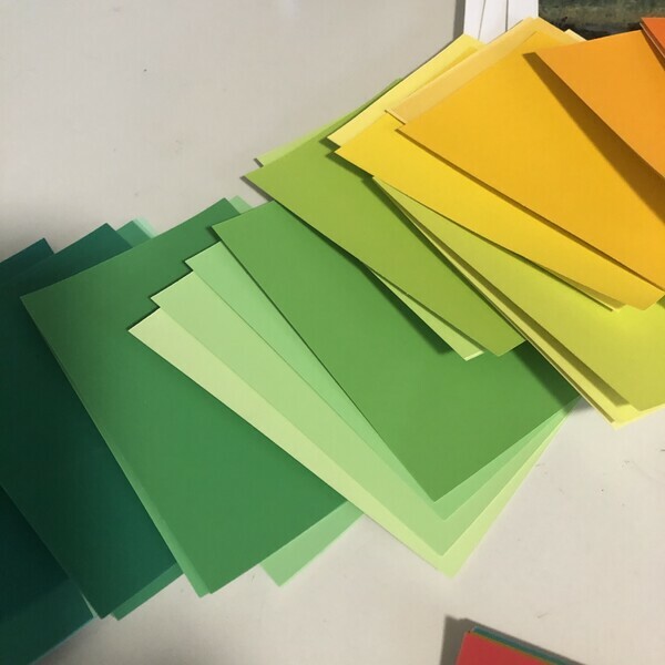
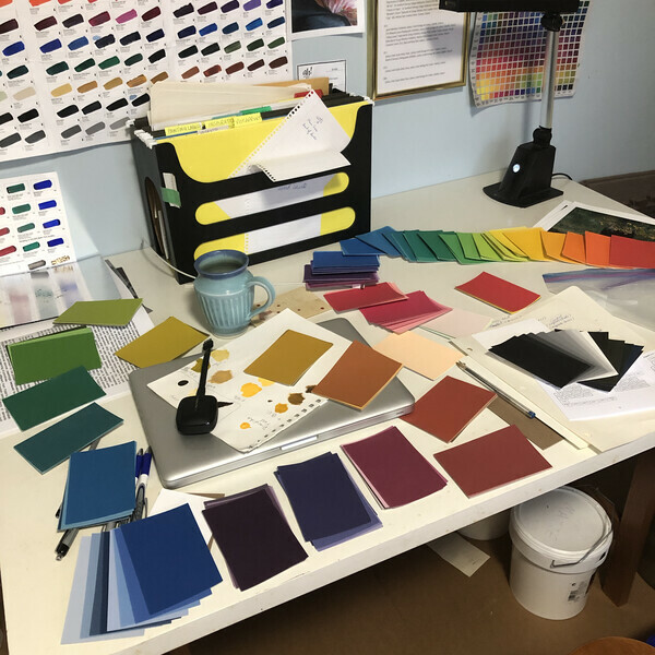
Artists are trained to reproduce any colour. If I am shopping in my new box of colours, I can hold the card up on my black background, decide it is right and go mix. If I need to mix up more of the same colour later in the work, I am able to do so.
I need less intensity when painting on black because black, the ultimate dark, contrasts so strongly that the other colours can glow. This can be wonderful but, if overused, a cartoonish feel can be created. I’ll mix up a green and have to keep desaturating it until it hardly looks green on the palette, but is definitely green on the black canvas.
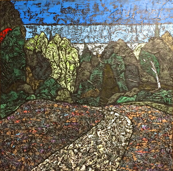
I almost never use a pure colour except (and there are always exceptions aren’t there?) when I decide near the end where I want a compositional element. So, really, I lied! I always use a pure (or just very intense) colour once on each painting to create a compositional element to draw your eye. This is because a pure colour beside a desaturated colour is a one of the contrasts that creates elemental power in the work. Take a look at my work and you will almost always see it.
Evening in Giverny
I am currently in week 9 of the Creative Visionary Program. I was reminded of the use of chromatic light in creating colour harmony in a painting. This is when one colour is added to all the other colours on the palette or when a colour is glazed over the entire painting towards the end.
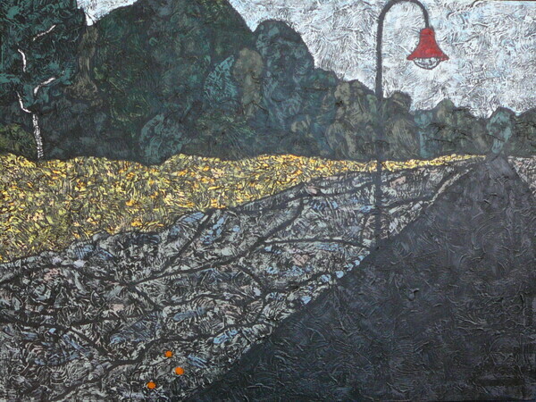
Evening Meadow
One of my paintings where I used these (tertiary) colours to good effect is in the meadow of “Evening Meadow.” The tertiary colours are sometimes called “rich.” Because there’s something special about a grey with a blush of colour, colours desaturated by using greys are called “sophisticated.”
I have to say at this point that my work in the past has been more “sophisticated” than “rich”! Let’s see what happens now?