| Galleries | | | Artist Bio | | | SHOP Collections | | | Join | | | Commissions/Kudos | | | Policies and Terms | | | Native Plant Resources | | | Exhibitions | | | Blog | | | Contact |
Blog 
(posted on 7 Feb 2024)
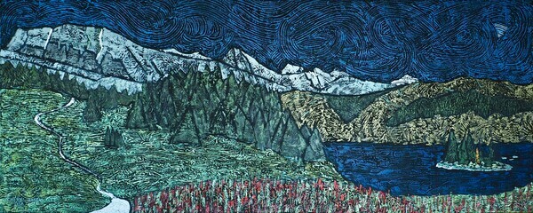
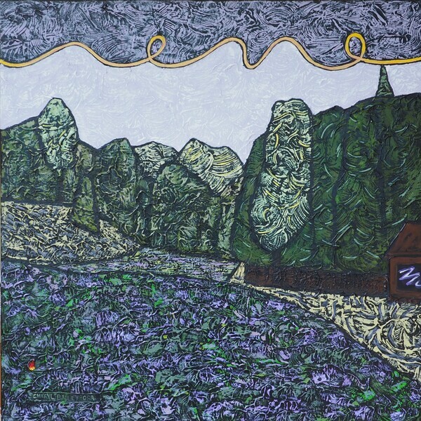
The new year and a 60" wide canvas brought thoughts of the Rocky Mountains. We have family in Calgary which means that we can make opportunities to visit the magnificent Rockies, particularly Kananaskis and the Banff/Lake Louise area. The first mountain I painted was well known Cascade Mountain in "Near Banff." I didn't know the name of the mountain at the time, but I knew that it was spectacular. The client who bought "Near Banff" in 2016 recognized the mountain despite the abstraction I used in the composition.
Our mountains provide endless opportunities for striking subject matter. I love them! There are the dark darks of the forest shapes and the white whites of the snowcapped peaks. Whites can also be snow leftover from winter. All of these and more can provide high value contrast which gives the composition power. And mountains are powerful!
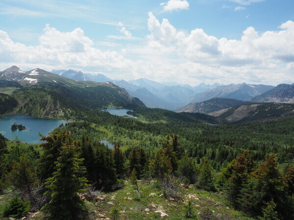
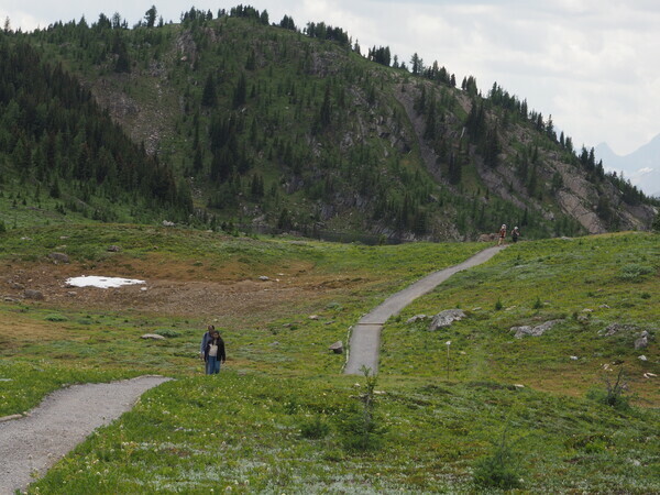
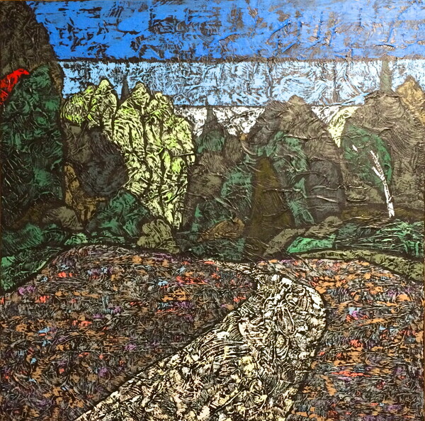
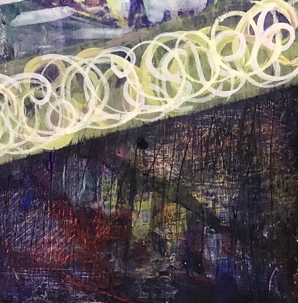
The current work is the result of hiking in the Sunshine Meadows near Banff. Don't you just love the name of the place? Sunshine Meadows. There is an entertaining gondola ride, especially exciting for the under 6 years crowd. This is followed by a chairlift ride further up to the meadows which spread before you in all their inviting glory. Hiking the trails provides unending vistas from higher and lower vantage points.
From a wooden platform, you can see three very pretty alpine lakes: Rock Isle Lake, Grizzly Lake, and Laryx Lake.
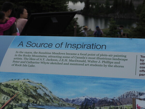
On our second trip to Sunshine Meadows, we took the trail down to Rock Isle Lake. The area has been popular with painters since the 1940s. Illustrious Canadian painters including A.Y. Jackson and J.E.H. Macdonald came from the east and the west to paint plein-air at Rock Isle Lake.
The current work is a view from along the path to Rock Isle Lake.
Your comments are always welcome: Comment
You've just read a blog post. You can also join my private email list here which will link to the blog.
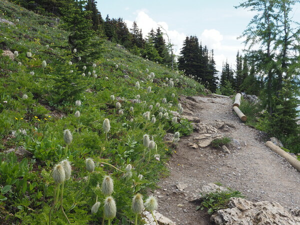
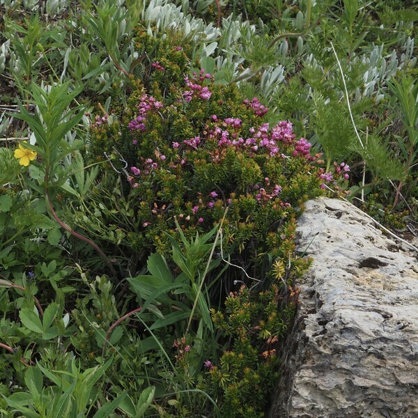
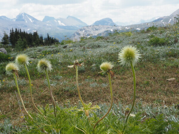
Here are a few pics from the hike-- ENJOY!
(posted on 7 Feb 2024)
Since I was a child, I have loved almost all flowers. (The Rattlesnake Master is an exception that comes to mind.) In the cool of the mid-summer evenings, I would help Mom water the garden. Pretty much a no brainer to stand at a distance and point a hose, right? Well I was helping and help is always welcome. Later, in mid winter, Mom would start seeds under the eight foot banks of flourescent lights hanging from the ceiling in the basement. I wasn't much interested in the veggie seeds like tomatoes (I was a kid) but I did enjoy watching the little seedlings popping up in the cell packs.
In Uni, a most useful course was horticulture. I spent frigid winter mornings in the warm greenhouse propogating SO MANY tropicals! Before we bought our own home, I had a garden on the apartment balcony in boxes my Dad made for me. We planted a garden right away after we bought our own home. What a surprise when all the lovely petunias I planted one day were mown down by the cutworms overnight. Apparently this happens in new subdivision gardens!?
Summers came and went and I had some pretty wonderful flower gardens over the years. The little ones would play in the backyard on the swings and in the sand. I would be keeping an eye on them, while I gardened.
Then---Aphids burst on the scene and ate everything. And Red Lily beetles chased the oriental lilies right out of my garden. Japanese rose beetles put paid to the enjoyment of my beautiful rose bushes. And then the years of drought. The hose would get left on by accident. Or it wouldn't get turned on and everything would dry up. The Garden had become a battleground. What was once such a productive past time had become a frustration. I lost interest.
Painting took a priority position in my life at about the same time that we bought a country property. I had all the space I wanted to garden. The soil was sandy in most places. A bit more loamy where the leaky hill allowed rivulets of water to travel down.
I debated with myself about what to plant in my new paradise. Because I like to learn from others' life lessons, I deferred to the experience of Yvonne Cunnington. She had planted 34 acres in all varieties of gardens- manicured through wild. She said the garden that she got the most pleasure from was the native plant meadow. Right! That's decided. That's how I came to learn all about native plants!
At first, all I was really concerned about was the fact that this native plant meadow was a great lazy person's project. (I wasn't getting any younger!) Then the knowledge from my degree in Biology kicked in, as did news about the whole pollinator crisis we are experiencing in Canada.
In a nutshell: Pesticides kill ALL of the bugs, good and bad. Without the bugs (our native bugs) pollinating and thriving, crops don't succeed. Mammals and other higher forms of life don't eat. Bugs are near the bottom of the food chain that we depend on. In my meadow, we have bugs that I had never seen before. I have identified over 20 fancy butterflies because we have provided the plants that they want for food. If you plant it, they will come.
The meadow we planted has provided me with lots of inspiration for my landscape-based artwork. This new year has brought me to paint 2 works that actually show the native plants- not in detail :) and the butterflies. I hope they will remind people to plant native plants.
If you have read through this ramble this far-- Congratulations! Now you'll see why I love my native plants: -- Because they take care of themselves! they survive bugs and drought. They may not thrive in a bad drought, but they always survive to bloom another day. We ploughed the field, seeded and mulched it. Then all we had to do was sit back and watch it grow!
So that's my story and I'm sticking to it! There's a slightly different angle to the telling HERE.
Here are the two new paintings (30"x30"):
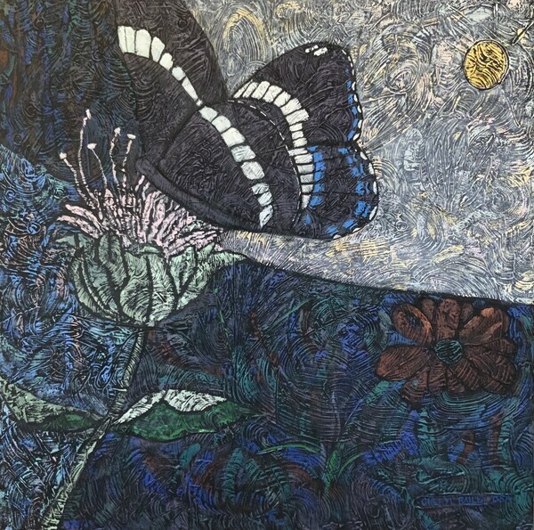
The White Admiral 30”x30”
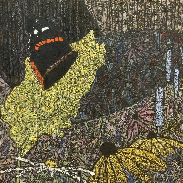
Pick Me! 30”x30”
The Red Admiral Butterfly is actually quite friendly. The first one I met landed on my leg to visit at the picnic table.
Your comments are always welcome: Comment
You've just read a blog post. You can also join my private email list here which will link to the blog.
(posted on 13 Sep 2022)
How often have you been surprised by the turns and twists in the path of your life? In general, life has exceeded all of my expectations but I did have a lifelong 'dream' of having a place in the country. About 20 years ago, I even had an actual dream in which a little house was situated on a hill. In this dream, I went out the front door and walked down the substantial grassy slope. At the bottom of the hill, I followed a path that meandered off to the left through a meadow surrounded by forest. It seems that my subconscious knew that I wanted a hill and some land.
In 2008, I began to seriously study art and to paint. Peter and I had often taken the very Canadian fall artist studio tours in the past. However, when we toured some of the studios in the Hills of the Headwaters region of Ontario, Peter began to understand what it was that I was on about. The artists’ studios on this tour were all located in these brightly fall-coloured rolling hills.
We began to tour properties for sale but the houses were always the selling feature. The lands attached to these places were not at all interesting to me. I finally let go of the dream. Unbeknownst to me, Peter had kept looking at properties online. (Isn’t he a peach?!) Late in 2009, he came up with a listing worth investigating and the rest is history.
We have over 11 acres in an area designated as a groundwater discharge zone. This means that the hill which runs the length of our property is leaky. Water pops up in various places on the hill, runs down a ways, then goes back underground again making its way to the river in our neighbours place. We have wet areas and very dry areas, meadow, cedar forest and wet lowland deciduous forest. This all makes for a biologically interesting property. Did I mention that I graduated from Uni with a degree in biology?
It seemed that I now had enough room to grow whatever I wanted! My practical side told me that I wasn’t getting any younger and that I should pursue a low maintenance project. During my research I came across another woman who had cultivated a native meadow as well as many formal gardens on a more commercial property. She told me that the garden she enjoyed the most was the native garden. This led me to study native plants.*
Vintage Cultivation for a Native Meadow
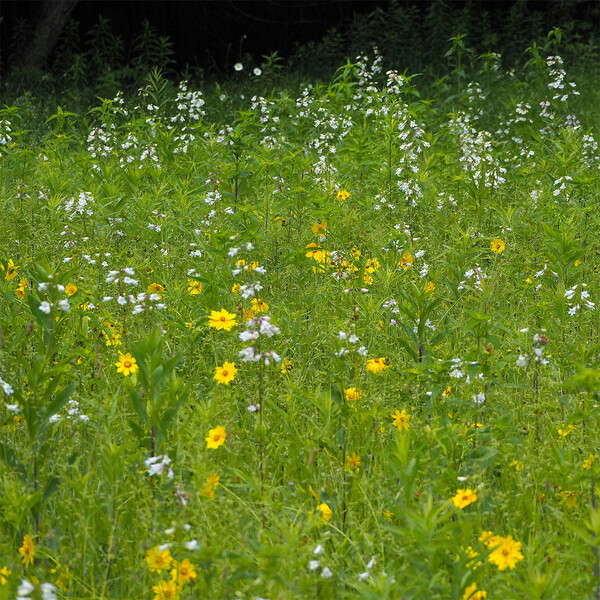
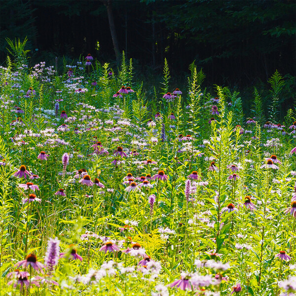
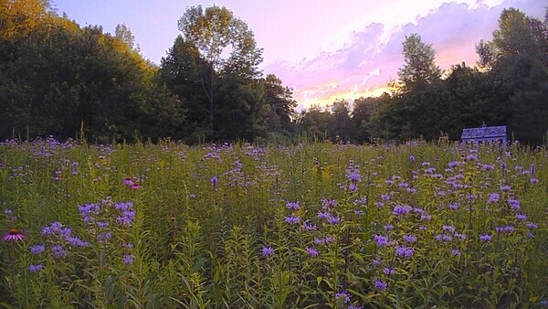
We bought a 1963 Ford Supa Dexter tractor in robin's egg blue and suddenly all things became possible! Remember the path to the left in my dream? Down that path which indeed headed to the left, we plowed, cultivated and seeded two large patches of ground with native seeds from WildflowerFarm.com. The plants, 22 different species, now 10 years old, are mature and the meadow is alive with life.
Hi Ho! Hi Ho!
I am pleased to be able to invite you to click this link in order to read the article about our meadow. It was written by Naturalist Don Scallen for the In The Hills magazine nature column. Don had been scheduled to give a presentation on native plants during my solo exhibition. The exhibition was cancelled in the early weeks of Covid. Don was quite excited after visiting our meadow this summer saying it was the largest project like this on private property that he had seen. He said that he wished his editor hadn't restricted him to 300 words!
My dream has become my happy place. Never give up on your dream.
*Native plants are plants that would have grown here in Ontario before European settlement. Our pollinators thrive on these plants. We in turn thrive on the food produced in this crucial chain.
(posted on 15 May 2022)
Is it a portrait or is it a landscape? Is it an abstracted reality or a non-objective abstract? These are two basic questions we can ask ourselves as we pull a painting together.
A portrait is usually about a particular person. The figure is prominent and using a good amount of the available surface. Details may or may not be evident.
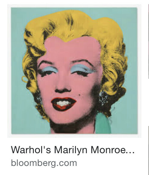
Think of Mona and Marilyn. Even though the actual painting is quite small at 15 inches, the figure of Mona Lisa takes most of the space. This week, Andy Warhol’s silk screen of Marilyn Monroe sold for a record 195 million US dollars. (The record is for a US artist’s work). This iconic work, ”Shot Sage Blue Marilyn” is a headshot. We can not mistake what these paintings are about. They are portraits.
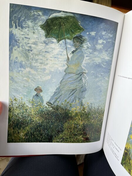
(photo from Monet by Karin Sagner)
Now think of Monet’s Woman with a Parasol. The woman is Monet’s wife. She is accompanied by her son. They are in a landscape but still they are very dominant in the painting. It really is a portrait of Monet’s wife.
As artists, our goal is to control the visual experience of our viewer. We can move your eyes around the work in 6 ways:
-using value contrast (where the lightest light meets the darkest dark)
-using colour intensity contrast (putting an intense colour next to a dull colour)
-using psychological weight (people, faces, things, buildings)
-using psychoactivity (the use of red-red-orange which we notice whether we want to or not. Why STOP signs are red.)
-using complementary colour contrast (red/green, blue/orange, violet/yellow etc)
-using dissonance (something that doesn’t belong - think geometric shape in an organic composition)
(can you tell I love lists?)
The strongest of these tools by far is value contrast but psychological weight comes in pretty high up the list.
Humans are compelled to look at faces. It is programmed into us. The power that a face has over us falls into the category of psychological weight when we are discussing art. Often the artist will turn the face away from the viewer. This somewhat decreases the psychological weight of the figure. In religious art, the gaze of the face is aimed directly at the viewer. It is difficult to get away from the face to see the rest of the painting. This is intentional.
Now let’s talk about landscapes.
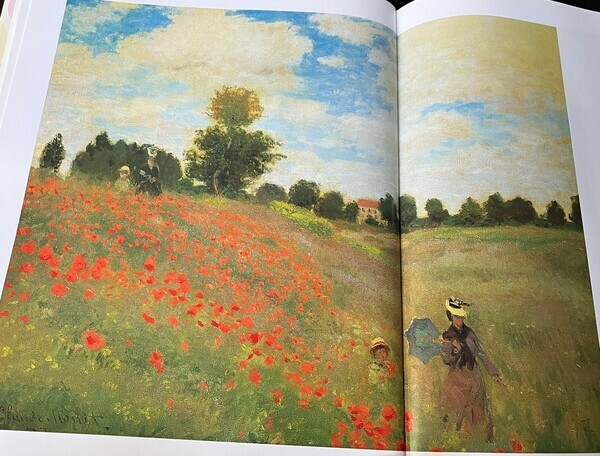
(photo from Monet by Karin Sagner)
Let's consider Monet’s The Poppy Field near Argenteuil. There are four figures. Two in the bottom right and two at the top of the hill, left. We don't see them at first glance but once we see them, we can’t miss seeing them. They have some psychological weight. However, we can get away from them to look at the other parts of the painting because they are much reduced in size relative to the rest of the painting and are not detailed. The faces are also darkened to match the value(light/dark) of the surrounding paint to make them less prominent. The hats provide a small value contrast to direct us to the figures, but have not nearly the weight of a clear face. These figures are only elements in the composition which is a landscape with a narrative.
What about Let Me Show You, my new painting?
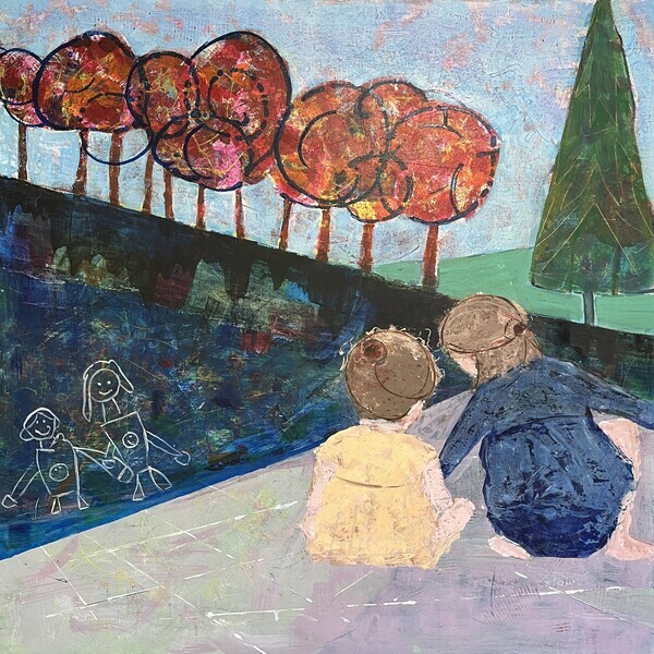
The two little figures are approaching quite a large size for a painting that is not a portrait but a landscape. Their backs are turned to us which eliminates the power of a full-on gaze. The value of the colours of their garments are matched to the value of the shapes behind the garments. The little girls’ heads are both positioned so that their darker hair is on the darker area. The big sister is positioned so that the dark shape of her head and dress join up with the dark shape beyond them. All this reduces the power of the figures in a landscape— sort of blending in. The red trees also carry the substantial weight of psychoactivity (the red) as well as high contrast of the dark swirly lines spilling on the sky.
The painting works as a landscape with a narrative bonus.
Hope your day is happy!
Your comments are always welcome: Comment
You've just read a blog post. You can also subscribe to my newsletter below which will link to the blog.
(posted on 2 Feb 2022)
Three degrees of separation.
So this happened:
Two weeks ago the Ontario Society of Artists (OSA) put out a call for entry to a 150th anniversary exhibition to be held in Orillia at the Orillia Museum of Art and History. Members are to create a painting with a relationship to a work by another member of the OSA. The exhibition it titled "Conversations: The OSA 150 Years”.
Some suggested options were to contemporize, re-invent, abstract, or transform a previous member’s artwork to a different medium. The choice was easy for me. I would abstract—and by extension contemporize a work.
But which OSA artist would I choose?
I looked through the member roster of the OSA including the deceased list and found an interesting name “Thomas Mower Martin.” His name was familiar to me. Why? Who was he?
Looking into his history, I found that Martin (1838-1934), born in England, wasn’t interested in the military career in India that his family had planned for him. After working for a short time hanging paintings in the Royal Academy of Art in London, he knew he wanted to paint and while working as a poorly paid draftsman, he began a study of watercolour. At the age of 24 and at a time when settlers were being enticed by free land, Mower Martin and his young wife Emma packed in British life and emigrated to Canada.
Alas farm life, on poor land in the rocky north of Muskoka, did not suit him, or more specifically his wife. They left and settled on a smaller farm near Toronto. There he carved out a good career for himself as a portrait, landscape and still life artist and was able to move to an eleven room home in Rosedale.
Martin longed to see and paint the breadth of Canada. The first of his ten summertime trips across Canada was in 1887, sponsored by CP Railway. Marmaduke Mathews (OSA) and F.M. Bell-Smith (OSA) went with him. (Both of these men served as president of the OSA.)
Here comes the 3rd degree of separation to me:
In 1910, Martin was 72 years young when my grandparents were being married in Rosthern Saskatchewan. The story goes that my grandparents took a trip east, no doubt visiting with members of the Swedenborgian church to which they belonged along the way. In Toronto, they received an original painting as a wedding gift from Mower Martin himself. Like our family, he was a member of the Swedenborgian church, a small denomination.
About five years ago, I shipped this painting to my brother. It had been left to him by our Uncle. The designation of “RCA”, for Royal Canadian Academy, beside the artist’s signature on the work was clear.
What I didn’t know at that time was that Martin was a founding member of the OSA in 1872—and that the members of the OSA were the founders of the RCA in 1880. I also didn’t know that he was a member of our small church.
So the first degree is my father. The second degree is my grandfather. The very cool third degree is that my grandfather knew T. Mower Martin, a highly esteemed member of Canadian art history, a founder of both the OSA and the RCA. And he gave us this painting!
In 2018, 108 years after my grandparents were gifted the painting, I was elected to membership in the Ontario Society of Artists. It is interesting to note that Martin and I are, to my knowledge, the only members of our church who have also been elected to the OSA.
Like Martin, I am an Easterner and like Martin my first trip to the mountains was by train. I love to paint our Canadian Rocky Mountains. Whenever we visit family in Calgary, we must also make a trip to the mountains. (That’s my rule!)
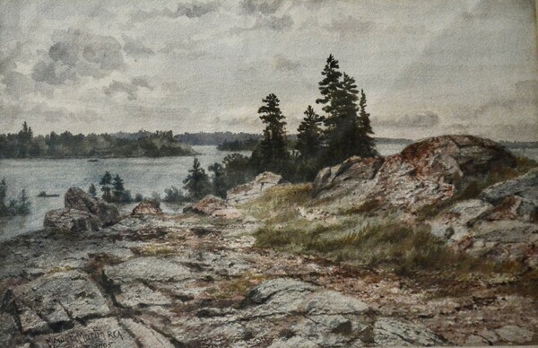
T. Mower Martin’s drawing “Mount Sir Donald Taken from Mount Abbott” is held in the National Gallery of Canada. You can view the collection on the web. The work shows a powerful peak, popular with climbers due to the extreme verticals. Mount Sir Donald is located in Glacier National Park near Roger’s Pass and is listed as one of the "50 Classic North American Climbs".
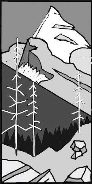
I have chosen to paint “Mount Sir Donald Taken from Mount Abbott, after T. Mower Martin” abstracting and simplifying the original drawing in my own personal way with stands of triangular spruces, single stick trees and a surprise of juicy colour.
Here’s the first step in my process: a value sketch.
And this is the url to Mower Martin's drawing in the National Gallery of Canada (because it is copyright protected)
Please do click to see it!
Mower Martin’s Sir Donald Mountain from Mount Abbott
Now I'll get to work!
(posted on 4 Nov 2021)
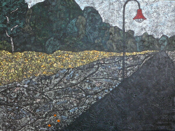
Different Strokes (or how the job got done)
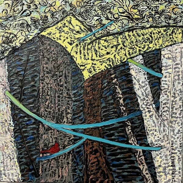
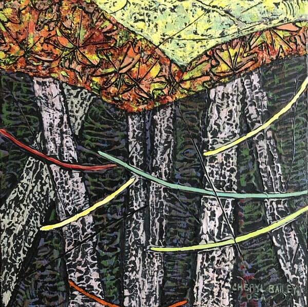
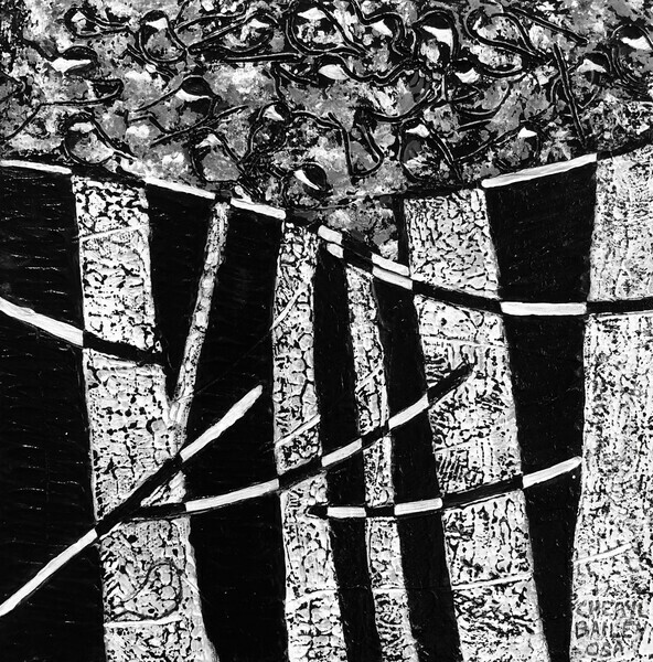
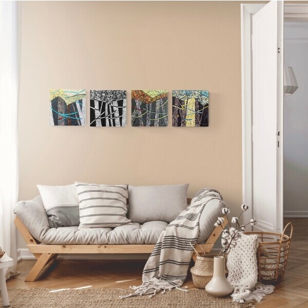
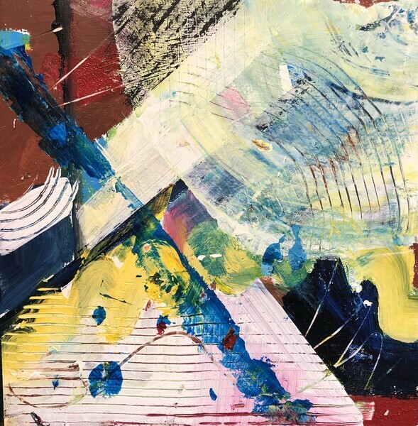
Within the last few weeks, I was able to complete a series that began almost a year ago. Usually my format is large and singular. These are only 12" squares so I began by creating the textured surface with them side by side on my work table.
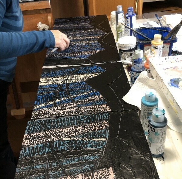
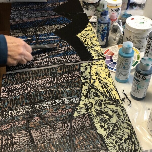
I’ve said in these blog posts before that a member of a series of paintings has some thing in common with the other members of the series. In fact, this series of small works was a followup to a larger work that was sold just before the pandemic. The larger work, Cardinal Under Cover, was very successful, even getting into a magazine article. I thought it would be interesting to pursue the composition further in a series.
Somehow the series stalled. When I worked on them all at once, they all looked like each other. This may have been efficient because I would have ended up with 4 for the work of one but it didn’t sit well with me. They were too much the same—a bit like an assembly line? Maybe if I had created a separate palette of colours for each one of them it would have had a different outcome. I set them aside and went to work on some other projects.
During the winter, an online course introduced the idea of the efficiency of working in series, hopping between the separate pieces when coming up against some indecision within a piece. I tried a series again in the context of the course but I ended up with very different pieces and not much hopping or efficiency.
I think the problem may be the fact that some of us fall in love with the idea of creating our painting and want to pursue it to the creative conclusion. When I diverted to another piece in the series, it was more like abandonment than diversion. Even though I understood the principle that I would return to it with fresh eyes, it wasn’t working for me. Was it just one more thing that I needed to practice to get it right? Perhaps.
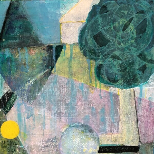
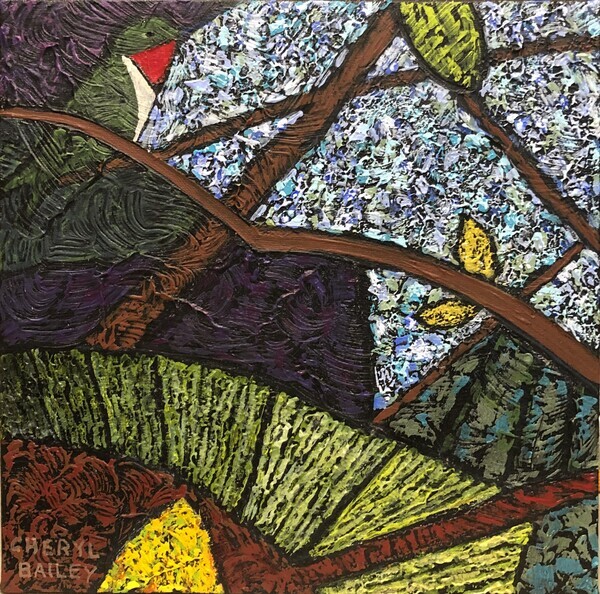
When I returned to the little four part series begun last year, I didn’t have a totally fresh idea. Yikes! That’s not supposed to happen. Blame it on Covid. I persevered and came up with Suspended in Cedars which is a bit of a riff on the the original larger version, Cardinal Under Cover. Branching out!
I took the next panel and injected the beautiful fall leaves that were just beginning to change. “Falling” resulted.The bare branches from the browse line became leaves (or branches;) I loved it!
When I turned to the 3rd canvas, I was thinking about our beautiful happy little chickadees, always dependably consuming the black oil sunflower seeds at the bird feeder. The black and white work “Formal Attire” resulted. The chickadees were chattering en masse in the forest canopy. I loved it!
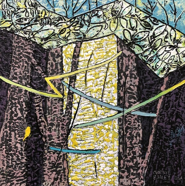
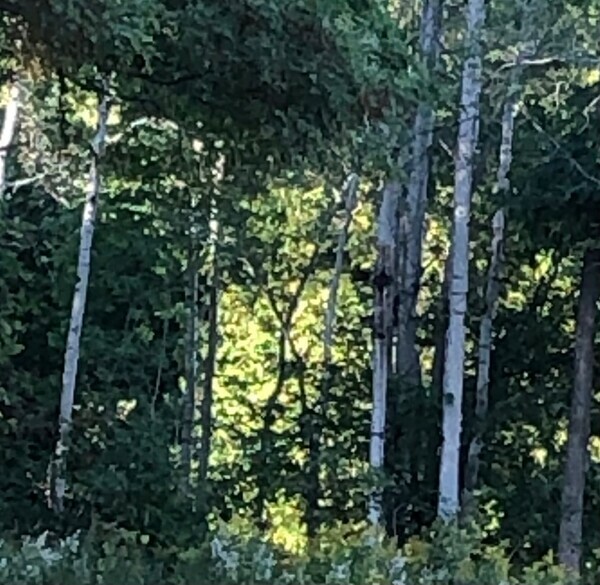
The fourth canvas started with the idea of changing up the value structure in the series. I wanted to make a strong T shape and remembered a sunlit vertical column (that seemed out of place, shown below) between trees at the edge of the forest. The T was strong. With the addition of the colourful striped branches in the dark deer browse line and a little bird coming in for a landing my need for movement was satisfied.
In the end, I got four little paintings. It was hard not to release them on the website as they were completed because I was excited about each one as I finished.
So there we have it: Different strokes for different artists. I needed to approach each canvas with a new idea.*
*Does that mean I wouldn’t have done a very good job if my four children had been quadruplets? We’ll never know!
Below: The series, related by composition
(posted on 27 Aug 2021)
In the spring, I took an intensive 12 week schedule of video and live zoom calls that make up the Creative Visionary Program.
There was not that much that was new to me in the first 5 weeks. I truly felt as if I was abandoning a best friend- the unique signature body of work that I have spent the last 6 or 7 years developing. It had become clear that I could not go with the flow of the programme basing the exercises on my current way of working. Happily though, I eventually I saw a window opening on some beneficial ideas that might further nuance my own work and perhaps develop a new body of work. Some of these new ideas have had to do with my art practice.
My usual modus operandi is to transform my inspiration for a painting into a small black, white and grey pencil sketch. I spend a good deal of time on this as it organizes the image before I start, ensuring a good abstracted and simplified composition. In the CVP programme however, the recommended working format is to develop multiple paintings at the same time. This not a new idea. What was new, to me anyway, is the idea that increased spontaneity may result as a limited amount of time is spent on each piece before moving on to the next.
I began a series of 6 panels. The series might be related by colour, subject, or not at all but moving often between the panels prevents them from becoming too precious.
Each ‘pass’ on a panel begins with a "play" period -- not something that I have done before, unless we agree to call 'throwaway marks' play. I haven’t used throw away marks in a big way. Play is followed with a ‘call and response’ session. This is usual and means the painting is telling you what it wants. When one of the panels reaches a higher level of development or when works slows, it is set aside and waits until the other 5 panels catch up.
Wiping the extra paint from a previous palette creates an underpainting. On one of the boards, I saw suggestions in the paint that I was able to work on without an advance plan. I wiped the palette off on more boards, providing me with several more interesting random starts.
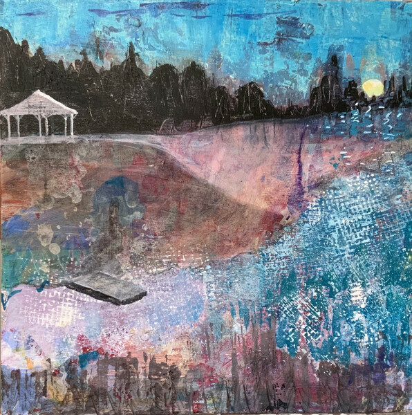
First shown is a play panel. Next started as the hill at the back of our property. I did some dripping for fun. Third is about summer evenings suggested by the random marks from the palette paper. Right away it made me think of Firefly Season and I went with it.
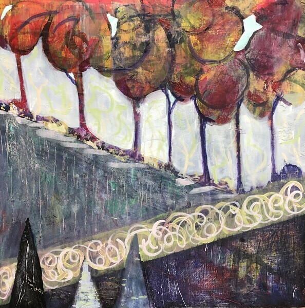
Maple Hill (below) was another result. It sold before it was completed. I had turned an abandoned panel upside down, then pressed a palette paper on. The palette swipe provided the fall colours. After I had painted the dark foreground, I took the sandpaper to this dark area. Sanding the dark paint revealed the rich marks (shown enlarged here) from the previous work (a hill actually) providing for me an intriguing effect in the dark shape. I really liked this and it has been the main impetus to further pursue this line of work. Only painting more will tell whether this goes somewhere for me or whether I incorporate something from this into my current work.
Your comments are always welcome! Stay safe and well.
(posted on 2 May 2021)
Recently I was asked how I chose my paint colours. This is a fun question because there are so many ways to look at colour. The first bit is an intro to colour theory and terms. Then below is what I do.
Quick intro on colour theory to start:
A particular colour will have 3 qualities
1. hue
2. value
3. intensity (also called saturation)
There are 3 primary colours(red, blue, yellow), 3 secondary colours (violet, green, orange all made by mixing 2 primaries) and almost an infinite number of tertiary colours(made by mixing a combination of all 3 primaries in varying amounts). (There are 2 schools of thought on the use of the term “tertiary.” This is how we use it.)
Between the primary hues on the colour wheel, there is a range for each primary. For eg for red , it can be an red orange , or a red red orange or a red violet. For blue, there is blue-green, blue-blue green and blue-violet. These are also called tertiary because they have all 3 primaries.
Within intensity, a colour can be a very light red (with a lot of white-a pink) through to a pure red and on to a dark red (with a lot of black). This is tinting (adding white) and shading (adding black). You can also add grays of all different values which is called toning.
The intensity or saturation of a colour can also be reduced by adding another colour. This can result in the rich earthy colours or just mud. ( I guess mud is earthy)
The value of a colour refers to the lightness or darkness of a colour. A scale of 1 to 10 is used to describe this from black to dark greys through light grays and to white. Many artists use a gray scale card. This is a card with the 10 values from black through grays to white. If you put a paint colour next to your gray scale card and squint your eyes, the impact of the colour will lessen and you can see what value on the gray scale matches this particular colour is.
Here’s what I do:
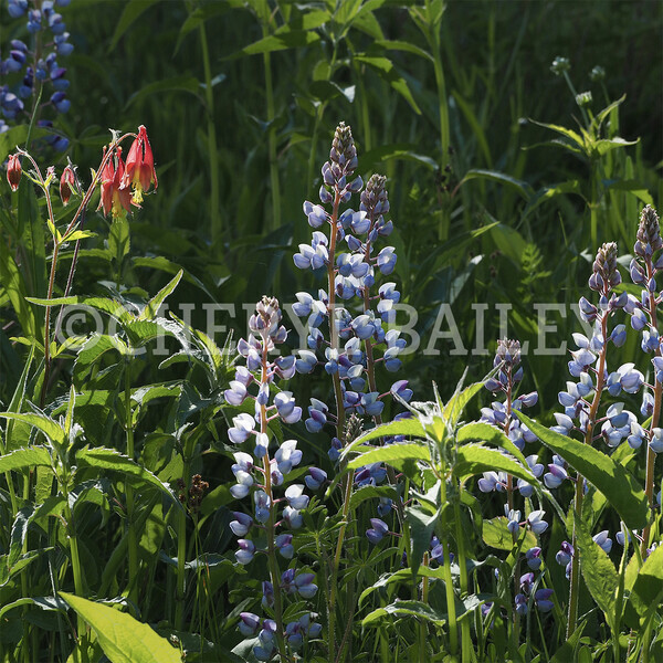
I’m a bit of a matchmaker ;) because I like to rather closely match the values of the colours in a shape so that the shape appears flat. If I also closely match values in a group of shapes, I create a larger visual shape. This ultimately results in a “value structure” of lights, middles and darks in the painting which lends calm and avoids a busy-ness in the work For example:
Lupins!
Busy-ness in the work is caused by a lot of light areas being mixed with a lot of dark areas. Not my style.
Sometimes I’ve decided on a colour scheme such as complementary (opposites) or analogous(colours beside each other) or monochromatic (just one colour) and stick to it. Other times I start there and then veer off to include other colours as well. Almost always I’ll have a blue since I love blue so much. A red is also very useful for moving the viewer’s eye around because we can’t not look at a red. This quality is called psychoactivity.
Over the winter, I lashed out and bought the Color-aid box (paint chips for artists) so I could just look/see/choose.
Artists are trained to reproduce any colour. If I am shopping in my new box of colours, I can hold the card up on my black background, decide it is right and go mix. If I need to mix up more of the same colour later in the work, I am able to do so.
I need less intensity when painting on black because black, the ultimate dark, contrasts so strongly that the other colours can glow. This can be wonderful but, if overused, a cartoonish feel can be created. I’ll mix up a green and have to keep desaturating it until it hardly looks green on the palette, but is definitely green on the black canvas.
I almost never use a pure colour except (and there are always exceptions aren’t there?) when I decide near the end where I want a compositional element. So, really, I lied! I always use a pure (or just very intense) colour once on each painting to create a compositional element to draw your eye. This is because a pure colour beside a desaturated colour is a one of the contrasts that creates elemental power in the work. Take a look at my work and you will almost always see it.
Evening in Giverny
I am currently in week 9 of the Creative Visionary Program. I was reminded of the use of chromatic light in creating colour harmony in a painting. This is when one colour is added to all the other colours on the palette or when a colour is glazed over the entire painting towards the end.
Evening Meadow
One of my paintings where I used these (tertiary) colours to good effect is in the meadow of “Evening Meadow.” The tertiary colours are sometimes called “rich.” Because there’s something special about a grey with a blush of colour, colours desaturated by using greys are called “sophisticated.”
I have to say at this point that my work in the past has been more “sophisticated” than “rich”! Let’s see what happens now?
(posted on 26 Nov 2020)
“CAMH Gifts of Light is a 100% donation-funded program that works with patients, families, and clinical staff to support areas that do not receive ministry funding. With your support, we can continue to help over 14,000 patients a year find the hope, strength, and courage they need to get through their hardest days and find a better tomorrow”
The patients at CAMH are in the most dire situations of human suffering assuredly made worse by the pandemic.
I've decided to find new homes for the photographs that were to be part of my solo exhibition(cancelled for Covid). When you purchase one of these stunningly mounted exhibition quality ready to gift and hang photos, 50(if shipped) to 70(if picked up) dollars will be donated to the Gifts of Light program.
Thanks so much for your help as we continue on in our journey to get past the Covid-19 pandemic. Here's the link:
All the best,
Cheryl
(posted on 26 Aug 2020)
Have I ever spent such a long time preparing for visitors?!! The answer would be a resounding “No!!”
Well, now we’re all ready for your visit! CherylBailey.ca has a fresh new look to coincide with the arrival of E-commerce.
Shopify, a highly rated Canadian company, will facilitate artwork purchase on our website. Of course you can also contact me to arrange to see paintings in person or a home trial.
The ShopHERE program for artists, sponsored by several levels of government and a number of large corporations, helped me set up the e-commerce on my website. We extend hearty thanks to the ShopHERE program.
The artworks have been loaded into the shop. They have been organized into 4 collections as shown on the website menu:
- High Views (mountains and long views)
- Meadows
- Smalls (small paintings)
- Eclectic(France and various others)
There is of course some overlapping. Most of the artworks have been loaded. Please enquire if you are interested in something in the Available Works gallery that is not yet in the shop. Paintings of the same size are the same price.
Art Gallery Burlington’s “AGB Shop” and Dragonfly Arts on Broadway (in beautiful historic downtown Orangeville) continue to carry my work.
If you enjoy my art, please spread the word. THANKS!
Time Out 12”x12”